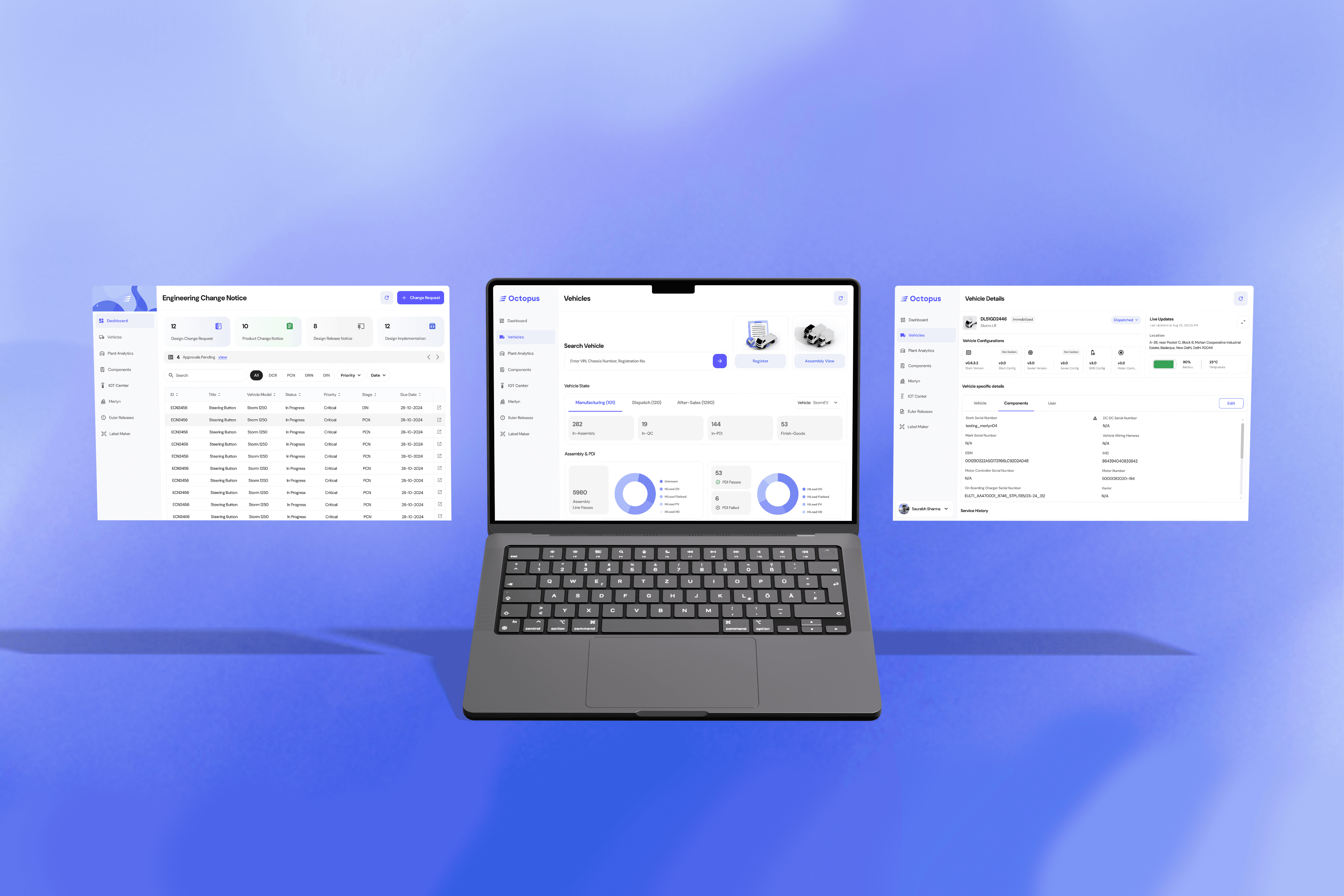
An OS for the Indian Commercial EV
I worked on designing a proprietary, Android-based infotainment OS tailored specifically for Euler Motors' commercial electric vehicles.

Knowing commercial EV drivers face high-pressure environments, we moved away from generic software to create an in-cabin experience that prioritized safety, comfort, and fleet efficiency.
What does Euler do?
Euler Motors is an Indian electric vehicle company dedicated to developing commercial cargo and passenger EVs, with a strong emphasis on advancing technology to drive sustainable mobility.
Role
Product Designer
Team
Mukul Dimiri (Design Manager)
Aalbin Benni (Product Designer)

The core challenge was ensuring this new system adapted seamlessly across various hardware models from basic 7-inch displays to 12-inch screens with ADAS. Despite these variations, we successfully delivered a distinct "Euler" brand identity alongside intuitive, zero-learning-curve ergonomics.
Challenge
Designing for a vehicle is fundamentally different from designing a mobile app. The UI is fighting for the user's attention against the road, the weather, and the traffic.


We weren't just designing an interface; we were designing a physical interaction model. We had to account for:
Architectural Foundations & HMI Ergonomics
Before designing a single screen, we established strict ergonomic guidelines based on physical hardware constraints and the layout of an Indian Commercial Vehicle.

Before designing a single screen, we established strict ergonomic guidelines based on physical hardware constraints and the layout of an Indian Commercial Vehicle.
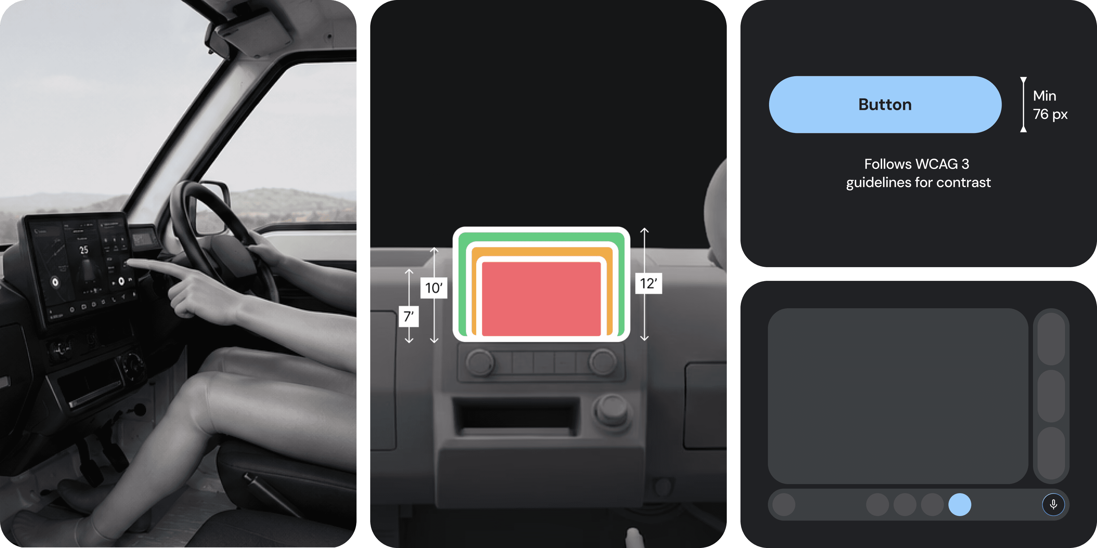
The Right-Hand Bias & Fat-Finger Architecture Because Indian drivers sit on the right, we inverted traditional software layouts. We anchored the most frequent interaction zones strictly to the right edge of the screen, closest to the steering wheel. To combat road vibrations, we established a strict minimum touch-target size and utilized high-contrast typography.
Information Architecture: Structuring the Ecosystem
With the physical rules set, we needed to organize a massive amount of vehicle data and applications without overwhelming the driver.

We conducted Interviews with fleet managers and drivers to map their mental models. The result was a flattened Information Architecture (IA) designed for maximum reachability. We categorized the OS into three distinct cognitive zones:
Vitals & Safety (Zero-Interaction)
ADAS warnings, TPMS, Battery, Speed. (Always visible, no tapping required).
Core Utility (1-Tap)
Maps, Phone, Charging, and Quick Settings. (Housed primarily in the Launcher).
Downtime (Multi-Tap)
Entertainment, Dashcam video exports, and deep vehicle calibrations. (Restricted while driving).
The Adaptive Launcher and Hardware Scaling
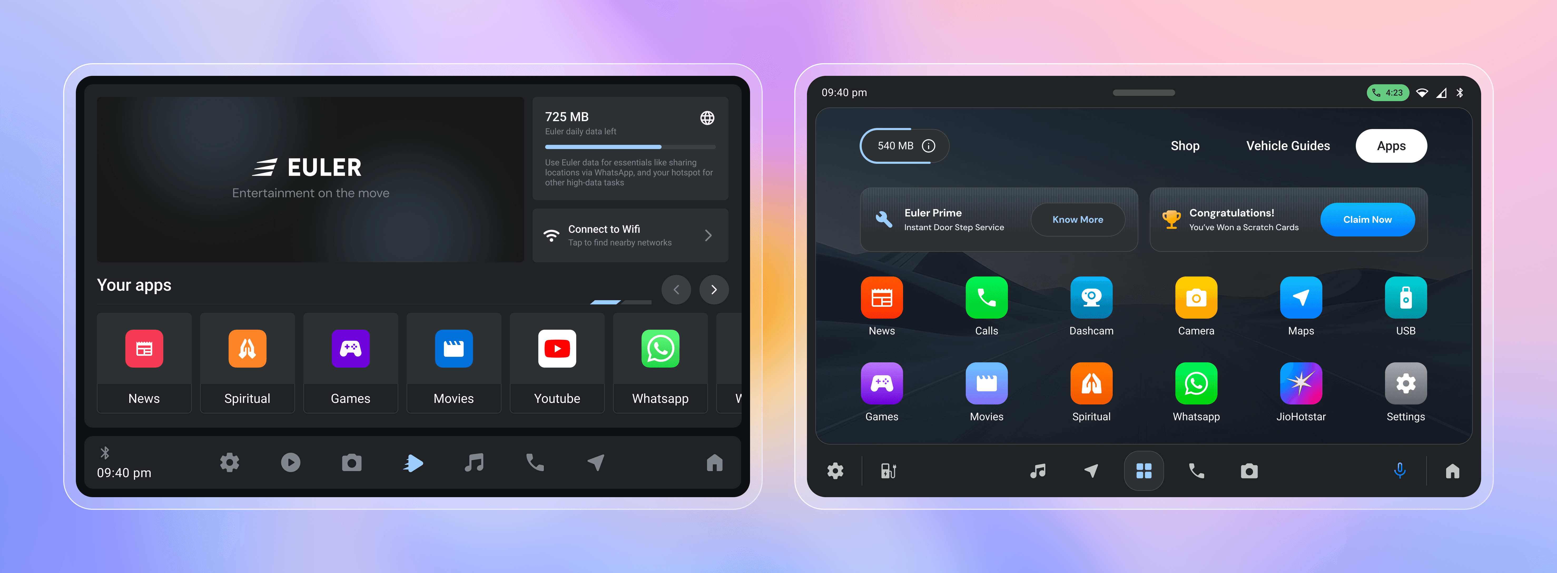
The interface scales across four display types. Basic 7-inch and 7-inch Lite screens focus on core utilities (without ADAS), while 10-inch and 12-inch models integrate full ADAS warnings.

Drivers spend 80% of their time in our glanceable, 3-pane widget launcher, designed to eliminate dangerous app-switching while on the road. This ecosystem adapts dynamically to both the hardware and the journey.
For our flagship 12" models, we evolved this into a horizontally swappable, customizable widget ecosystem, giving power-users full control over their digital environment.
Solving Range Anxiety: Contextual Routing & Charging
For the newly introduced intercity logistics vehicle, the MVP was maximizing range and minimizing charging downtime. Range anxiety is the primary psychological barrier for commercial EV adoption.

To cure range anxiety, the OS is spatially aware. When the battery drops, it automatically surfaces partnered charging zones on the launcher and enables frictionless RFID tap-and-pay right from the screen.
Downtime is Driver Time
When the vehicle is safely parked, the UI unlocks a dedicated entertainment hub featuring YouTube and games. This psychologically shifts a driver's downtime like waiting for cargo to load from stressful "lost time" into relaxing "recovery time."
Testing and iterating with feedback
We got users to try these prototypes, observed how they used them, how they felt, and got tons of valuable feedback.

Key Results
81% Launcher Screen Time
High interaction with the 3-pane design proved it successfully reduced cognitive load and app-switching while driving.
60% Offline Map Reliance
Validated our offline-first maps, ensuring drivers without phones or internet never got stranded in dead zones.
28% Charging Tool Spike
Adding the tool from mobile-only to an automated in-car "Nearby Charger" pop-up successfully drove more navigation to stations.