
Context
Designing for 1 AM is fundamentally different from designing for 1 PM. The user is tired, in a dark room, likely using one hand, and has zero patience for browsing.
To better grasp the context better i I also studied about how inventory management works
Inflow(refill) → Stocks(inventory) → Outflow(sold mostly or expire rarely)
Live market - 0 delay in Feedback loop
My approach to the "Late Night Store" inside Blinkit strips away the visual noise of the daytime app. The core focus is on comfort, speed, and honesty. No dark patterns, no aggressive upselling, just a calm, focused interface that gets them what they need so they can go back to sleep.
Design
The Storefront
Since the late-night inventory is intentionally capped at roughly 30 items, the standard search bar becomes less critical.

Curated Categories
I brought 5 highly relevant categories (Something to Eat, Pharma, Everyday Essentials, Hygiene & Wellness, Gadgets) upfront. These are based on actual late-night user behavior.
No Clutter
I chopped all extra banners and non-essential UI elements to allow undivided focus.
Flipping the 25 mins contraint
In today's Q-commerce market, 25 minutes can feel slow. Since late nights mean fewer delivery partners, I introduced a psychological pivot: The 40-Minute Eco Delivery.

By offering a "Opt for 40 mins, pay zero delivery fee" option, a slower delivery becomes a reward rather than a penalty.
Coupled with simple "Buy 3, get ₹50 off" offers, the late-night premium feels justified and fair.

Product page and checkout
Instead of manufacturing panic with red text and ticking clocks, I handled scarcity with a calm, transparent progress bar.
Showing "12 left tonight" informs the user of reality without employing manipulative dark patterns. It builds trust.avior.
Checkout needs to respect the physical environment of a sleeping household.
I introduced three night-specific delivery instructions front-and-center: Avoid calling, Leave at the door, and Don't ring the bell.
The checkout flow remains strictly one-handed, with the core total and CTA anchored to the bottom right for the user's thumb.
Edge cases
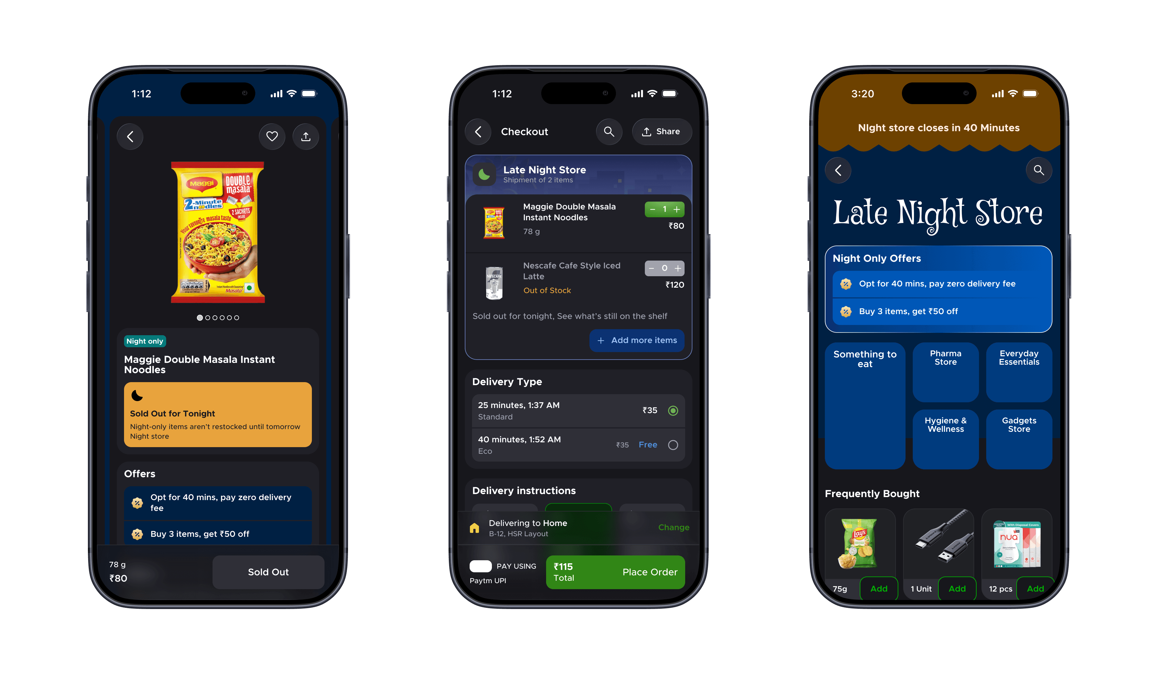
Sold Out (Product Page)
A muted, un-clickable "Sold Out" state that clearly communicates the item won't be restocked until tomorrow.
``
Sold Out (In Cart)
If an item goes out of stock while the user is checking out, the app doesn't block them. It clearly highlights the out-of-stock item and offers a helpful fallback: "Sold out for tonight. See what's still on the shelf," paired with a low-friction "+ Add more items" CTA.
``
Closing Soon (3:40 AM)
A clear, non-intrusive banner at the top of the storefront honestly communicating exactly how much time is left before the store winds down.
Design Foundations
Dark Interface Discipline
I followed blinkit UI colours. I created a bespoke dark palette based on Blinkit's brand (yellow/green accents). The contrast ratios are softened to be legible in a pitch-black room without causing eye strain or screen glare.
Font sizes were also cross checked with Blinkit's design language.

One-Handed Ergonomics
The entire flow is optimized for a single thumb. Core actions (Add, Cart, Checkout) are anchored to the bottom third of the screen.
Assumptions
1. Users are willing to wait 40 minutes if the delivery fee is waived, effectively balancing the load on late-night delivery fleets.
2. Late-night purchases are heavily skewed toward instant consumption, hygiene, and emergency items.
View Figma File
Thank you!!!